UX Design Process
Background
In Canada, our tax software needs to be certified by both Canada Revenue Agency (CRA) and Revenu Québec (RQ). In preparation for the certification, we have to work closely with the regulators to ensure our software meets government regulations and requirements.
This is a case study of using the UX design process to bring forward a user-friendly solution. In this project, I worked closely with tax analysts, product owners, and developers.
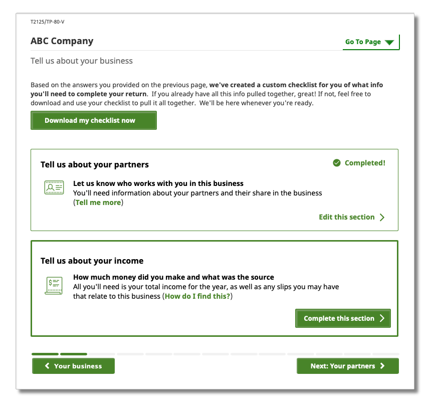
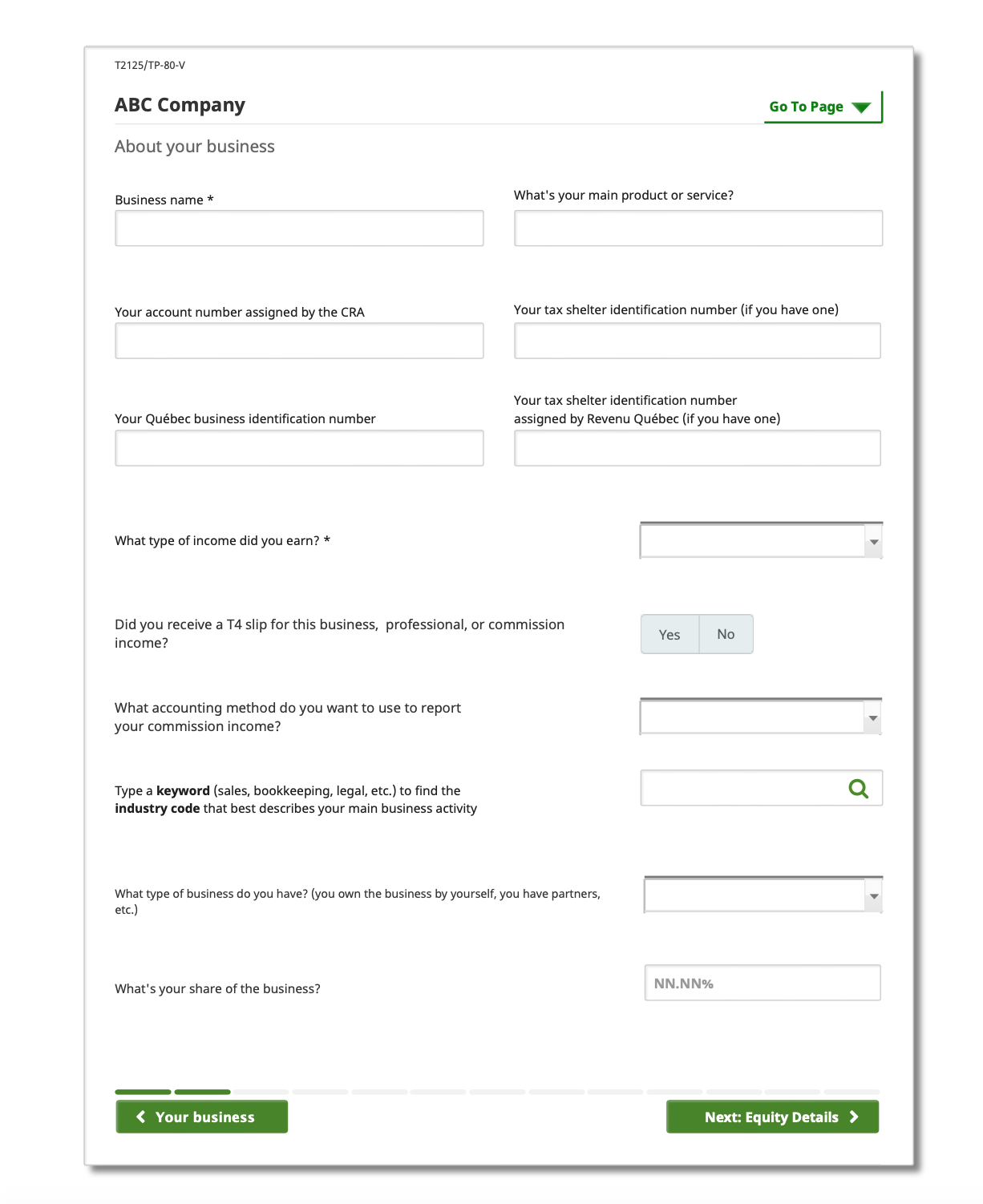
Business or Professional Income Form: T2125 & TP-80
The T2125 is used to report professional or business income including self-employment and commission sales. The net business income is posted to the total income as taxable income. A separate T2125 is required for each business from the same taxpayer.
For residents in Québec, if they have earned professional or business income during the tax year, they are also required to fill out a TP-80 for each business.
Current Challenges
Compliance with regulations
Tax season usually opens in January allowing users to file their tax returns for the previous years, many users are eager to be the early birds. For the benefit of our users, as well as our company, our software also opens in January. Because regulations changes every year, and most regulations are not finalized until the last quarter, this pushes our design and development to a tight project window.
Tax Complexity
Canada’s Tax system is one of the most complex tax systems in the world. “From 2001 to 2016, the length of the federal personal income tax guide for Ontario increased from 48 to 78 pages, for 63 percent growth over the 15-year timeframe.” – Finn Poschmann, Fraser Institute. We have users who have simple tax situations, such as a single T4 (employment income) and some donation receipts. We also have users who have very complex situations such as changes in tax situations, for example, life events graduated from college, got married, and opening a business. The users do not always have the knowledge of how to complete their tax returns correctly.
Our Goals
Our goals in this research project are
- Finding out our customer journey when filing returns in a retail office
- What steps involve during the process
- What are the pain points with the current software
- What our users like to see in the future software
- Collect data to improve customer satisfaction

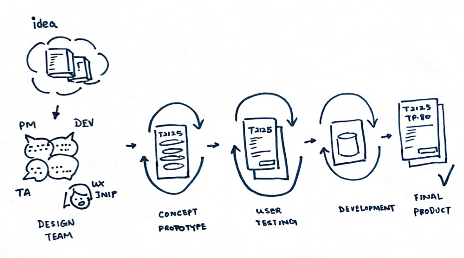
Design Process
Like most of the digital team, our team has project managers, analysts, developers, and QAs. I joined the Digital Team in August 2014 as the only UX Designer in this new kick-off project, I got involved in many aspects of software development, this includes feature design from ideas through prototypes, high-fidelity illustrations, and testing to delivery.
Problems Analysis
In this project, I worked closely with Tax Analysts who are familiar with Federal and Québec tax regulations. There are many difficulties that our users faced when filling out the forms, this included:
- Users have to fill out some personal information every time for all tax forms, and repeated tax information for Québec residents.
- Users have little understanding of the tax terminologies, and support may not be available.
- Many times, the policies and definitions of terminologies are different between Federal and Québec tax forms.
- Users need to calculate the tax inputs, such as if a business has a fiscal period start date or end date that is not on a calendar year basis.
- Multiple forms need to be attached for different tax situations.

Concept Prototypes
In a kickoff meeting with the product design team, ideas and requirements are gathered. Concept Prototypes were circulated with the team to get feedback.
For each tax pro we interviewed, we started by introducing ourselves, providing some background information, and the purpose of the study.
Users Testing
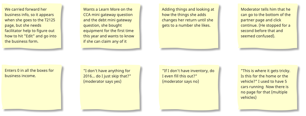
After a few revisions, I put the prototype into interactive wireframes for a usability test. We analyzed the testing results and realized our initial design had some problems
- Our design missed some features that users expected.
- Some terminologies were not clearly explained.
- Our design and layout of this form were based on the paper form from the government, not all the users were familiar with it, and information become hard to find.
- The information architecture was not organized for online users. “I don’t know where to add utilities (heat, water, electricity…)”
Finalize Design
With the valuable user feedback, I revised the prototype, and review the user’s testing until we were satisfied with our design. And when we were confident with all the findings, I created a high-fidelity wireframe for development.
Takeaways
Not all the features requested by users were addressed, but we put in a plan, and we know that the features are in the roadmap for future development.
For many users who live in the Québec province, there is an additional layer of complexity as they need to fill out tax forms from both the Federal and Québec governments. Future studies will help us design a better solution for residents living in different provinces.
We also have a wide range of users with different levels of online experience. The terminologies we use will need to make sure users can easily understand and follow, so they can complete their tax returns with limited external help, in a reasonable amount of time.